3.07.2010

i haz a contrast.

O hai, i can haz moar contrasts?

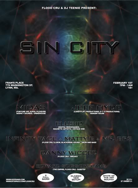
First off, I get it.  Most dance music events have this dark thing going on...I mean, most of the places are dark and there are sometimes lasers involved.  Also, a lot of the music includes dark and foreboding samples and noises, in some cases from sci-fi or horror movies.  Believe me, I get it.  So the first thing that blows me away is this need to make this flyer just so dark and evil.  In the quest for dark evil, it has also made the flyer hard to read.  The font use is OK (IMO) but at the same time it is both too dark and too small.  I hope they didn't send this one off to press or worse, just make copies of it at Kinko's, cuz it would seem to me that it would be a nightmare to print.  I would've also rearranged the informational texts, i.e. dates, place, venue info and put them in different places.  One other thing, I'm not sure what a fluorescent spider-looking blob has to do with any kind of idea for a Sin City theme.  I've heard that it's best to maintain some sort of theme when making a flyer for a recurring event so you have easier product identification among the stacks of flyers at your local counterculture/record shop, so I'm curious to see what the other flyers for this looked like.  No me gusta.
 

Meh.

OMG.

This flyer makes me want to confiscate the cracked copy of Photoshop this dude has and throw it against a curb a few thousand times.  I like when people use pictures and just add font layers, because done correctly, it still works and it's quick.  What I don't like is boring use of fonts and unnecessary use of glowing text.  I mean, Arial?  Really?  Why do Johnny and Daecos get stuck with the size 7 fonts at the bottom?!  Oh yeah and have fun finding the party info right away, you have to either tilt your head or the flyer (if they wasted the money to print this).  Ugh.

Nice.

I really like this flyer.  It just screams professional.  Plus I'm a huge fan of ads or flyers that have this organic feel to them, be it vibrant or gritty...but not so robotic, if you know what I mean.  I've seen similar work for indie shows or for dance music that is NOT club-oriented per se.

This was done for my old crew in Texas for a show this past weekend.  The colors are brilliant, and so is the illustration.  It's simple but there's still a lot going on IMO.  All of the information is broken up which enables people to see what's going on.  Plus, the fonts echo each other and there is no overuse of special effects layers or anything.  This is a flyer that if I still had my rave wall, I'd totally hang it up.  Again, well done.

Too many fonts.

I came across this one today for a show in Worcester, MA.  One of the things I hate about it already is the fact that there's too many fonts in play, and the fonts themselves are lame.  Seriously, raves are not the stuff of the future anymore, so please stop using sci-fi "future" fonts!  Plus, unless you're a local, you have no idea what kind of music is going on, and there's nothing worse than expecting, say, drum 'n' bass, and showing up at a trance show.


Personally, I would have had the pictures smaller and included more information about genres or timeslots.  The way the text is on the bottom, you have to hunt for details as they don't necessarily stand out right away.  I probably would've also placed the date elsewhere, like near the name of the event so at first glance you have a good chunk of info already.  While this flyer isn't as bad as some others I've seen (thank god there is no use of inner/outer glow in evidence), I don't like it...definitely could've been done a lot better.

Welcome to the sadness.

I have been a longtime partygoer, enjoying beats since the mid-'90s, and having attended my first proper rave back in 1997.  One of the things I remember about club and rave nights way back when was that each party flyer had its own flavor.  Some were ginormous 24x36 posters, others were tri-folds, or simple 4x6 sizes, or even ones that folded into interesting shapes.  I've seen one flyer that folded into a giant cereal box.  In Amsterdam, one of the weeklies there distributed flyers in small plastic bags that looked like acid sheets.  For a while, I was like every other raver and collected just about every rave flyer I came across in my travels.  Some shows/parties I went to, others I'd promise myself that I'd go, but inevitably I'd forget or wouldn't be able to.  Before I thinned out the collection I had probably 500 flyers from all over the U.S. and Europe.  In addition to that, I've been on at least 6 or 7 different dance music forums, each with their own events sections since around 2004ish, and have seen dozens of examples of e-flyers.  So with that being said, I've seen many a flyer in my day.

This blog is a showcase for those unfortunate ones that have suffered from poor creative follow-through, whether through inexperience or just plain bad taste.  I'm no graphic designer, but it is a field that interests me.  One of the many rules I've heard about design is to keep it simple, both with text and graphics, because you're trying to make it easy for potential partygoers to understand the details of any given party.  When a flyer is a mess, it's doing a disservice to both the venue and the DJs involved.  Not to mention, it also makes the promoter look like he's skimping on something for his event, because with a shit flyer, good design is being sacrificed by putting out something cheesy--so what else is he trying to save money on?

Ultimately, when bad flyers come out, professional graphic designers look bad.  I know people who work in the field either professionally or as freelancers, and I've begun to feel their pain when I've seen horrible design over the years.  The availability of cracked versions of Photoshop, Illustrator, and other popular image manipulation software has given people the illusion that they know how to design things.  Hell, I've been guilty of it myself when I was doing small bits of promoting for different production crews I was a part of.  This is similar to people who think they rule at karaoke, so they think they should get a recording contract over people actually trained in music.  Maybe people don't realize it but there are some great designers out there, and sometimes, they won't charge a whole lot to give you a professional product.

So without further ado, here are the unfortunate flyers.